


 This is what gets me mad the most: “We made a conscious decision not to spend a lot of money frivolously on throwing things out that are perfectly good just because it had a different logo on it,” LCBO spokesperson Lisa Murray told Newstalk radio 1010.
To the LCBO and its reckless campaign of spending taxpayers’ money with no accountability whatsoever, a new logo redesign at a jaw-dropping cost (at least to most sane people) of $500,000 is somehow not “frivolous?”
As Murray tells the Toronto radio station, don’t fret, Ontario residents, the new logo will only start showing up on letterhead and storefronts when they a) run out of the old paper and b) build new stores. Comforting news!
 There’s all kinds of wrong with that, of course, not that the mega-bureaucracy of the LCBO would ever understand. They’ve been spending like drunken sailors for so long that they have no idea how the real world works. This happens with monopolies, in this case a throwback from the post-Prohibition era seemingly run without the scrutiny of the government or any overseeing body with the balls to make them accountable for their actions.

The LCBO has become its own government, running roughshod over the very bureaucracy that it is supposed to be “controlling” them.
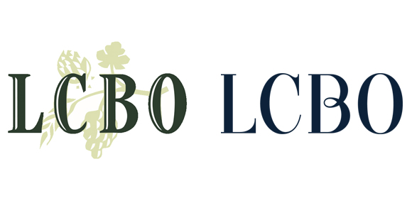
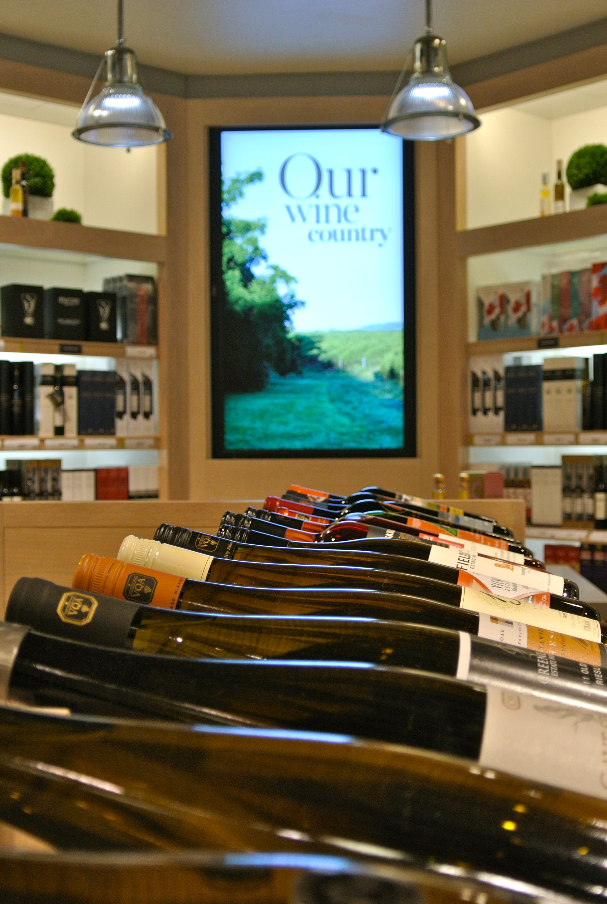
How else to account for $500,000 being spent on a new logo that simply consists of the letters LCBO, in navy blue font with a curly-cue on the letter B. Vice-president of marketing at the LCBO, Kerri Dawson, told Marketing Magazine the new look is more contemporary and clean, while doing away with background images that do not paint a full picture of what the LCBO offers.
“A lot of people saw it as grapes and grape leaves and it had the connotation of wine,” Dawson maintained.
The horror! The horror!
 One minute the LCBO tells us that if we kill off the LCBO monopoly and open up the province to a more modern approach to booze retail, like privatization, hospitals won’t be built in Ontario, children will die, and we’ll be treating cancer patients in the streets. The next minute it’s somehow OK to spend a half million dollars on a new logo that removes grape leaves because “a lot people” associate the LCBO with wine and not the greater selection of booze offered for sale in their grandiose and getting gradioser stores.
With the logo comes a rebranding that moves away from the former catchall phrase “Discover the World” to the new “Let’s Get Together” brand makeover. Of course, the LCBO doesn’t work in a vacuum (insert sarcasm here), these changes were made, according to Dawson, because customer research showed it was time to evolve to something more engaging.
To make its point, the LCBO made this video (cheesy alert!):
Let’s Get Together from LCBO on Vimeo.
Nowhere can I find where these “people” who were tired of the Discover the World slogan and the grape leaves are from and how the LCBO found them. Obviously they have a great deal of clout to exact this kind of change at the LCBO.
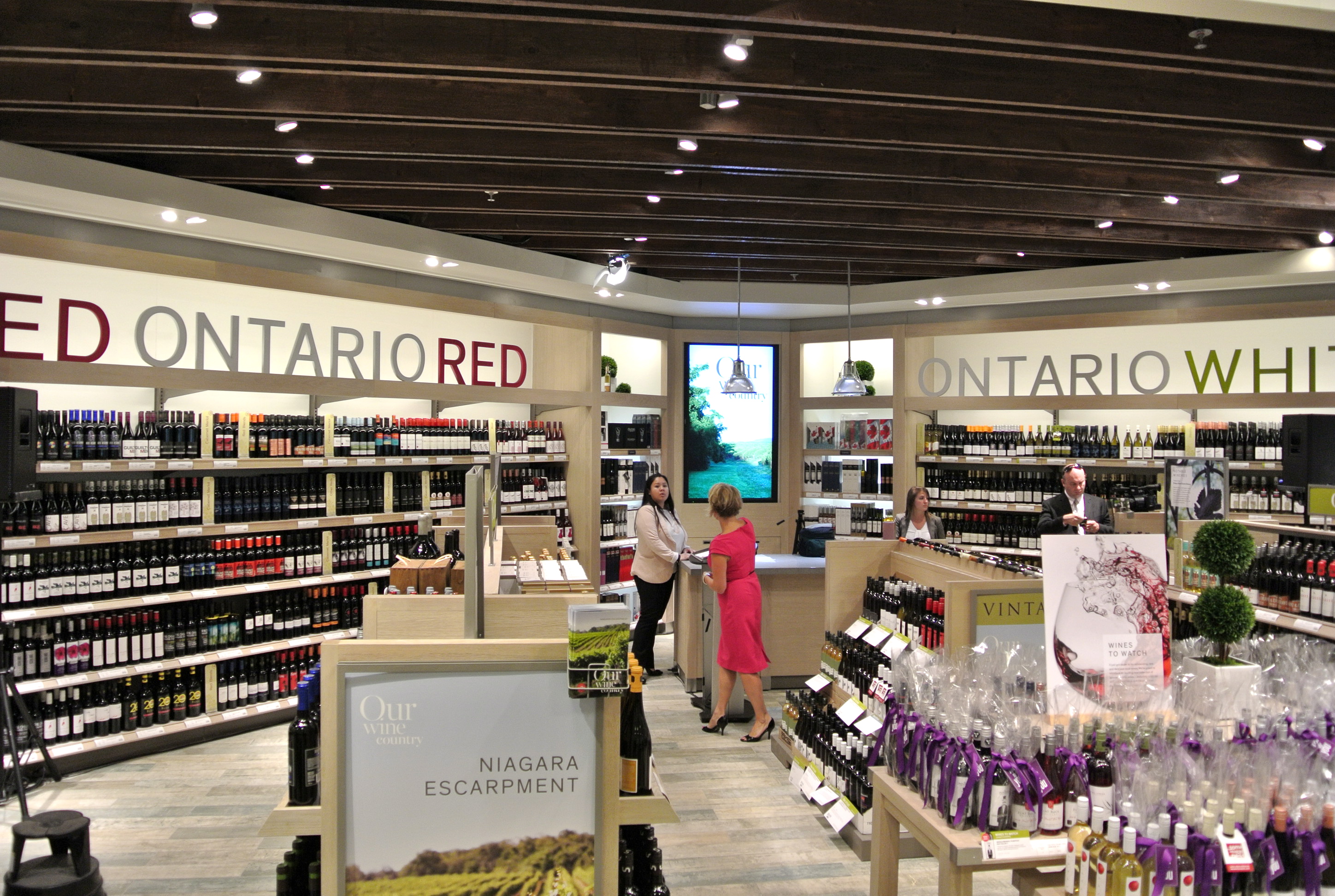
 According to the Newstalk report, the new logo is already up at Toronto’s urban concept LCBO in the Beach and at a new shop in Mississauga. The refreshed emblem was printed in the latest issue of Food and Drink, a free glossy magazine available at the LCBO and it is featured on the LCBO’s re-tooled web site.
The changeover in logos will be a gradual process with no clear target date for all LCBO stores to make the switch.
The most compelling reasons (again, sarcasm alert) for the changes are explained by Dawson in Marketing Magazine.
The LCBO’s former brand vision – “Discover the World” — served it well for the last 10 years, she told the magazine, but customer research showed it was time to evolve to something more engaging. It’s the customer research that gets me. Really?
So they hired a PR firm to help “refine” where the LCBO was headed with the “Let’s Get Together” brand vision, as well as create elements such as a new logo, crest, typefaces and colour palette.
Consumer feedback included positive associations with the brand, including references to it being “efficient” and “socially responsible,” but consumers also felt the LCBO could become more social and interact with them in a casual way, said Dawson.
I’m dying here; of laughter.
 Consumers actually felt “positive associations” and felt Let’s Get Together evoked “efficient” and “socially responsible” reactions with the new branding.
Sorry, hide your eyes, but it’s pure bullshit. There, said it.
And the biggest groaner of them comes from Murray. She told Newstalk radio that the government-owned LCBO is a retailer like any other in the province and has to do what it can to stay competitive. She rejects the notion that province has a monopoly on alcohol sales, pointing to the Beer Store and private wine shops as challengers for your booze buck.
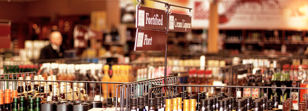
![]() Private wine stores? Is she referring to the stores owned by the U.S.-owned Constellation Brands (formerly Vincor) and Peller Estates? The LCBO is afraid of them? Come on. They offer a small collection of VQA and “bottled in Canada” wines from their own companies. Are they a threat to you? The government still gets a take from every bottle sold at those stores and they don’t have to pay a cent for infrastructure or staff. While it’s unfair to every other winery and wine agency in Ontario that they exist under a grandfathered licence (pre-Free Trate) they are hardly a threat to the LCBO.
Private wine stores? Is she referring to the stores owned by the U.S.-owned Constellation Brands (formerly Vincor) and Peller Estates? The LCBO is afraid of them? Come on. They offer a small collection of VQA and “bottled in Canada” wines from their own companies. Are they a threat to you? The government still gets a take from every bottle sold at those stores and they don’t have to pay a cent for infrastructure or staff. While it’s unfair to every other winery and wine agency in Ontario that they exist under a grandfathered licence (pre-Free Trate) they are hardly a threat to the LCBO.
The Beer Store, well that’s just another big kettle of fish. It’s another monopoly owned by foreign beer companies that just adds to the woe of this big fat mess.
The white elephant in the room isn’t the LCBO logo, a slogan or the brand vision. It is that the LCBO exists in a day and age where the model is antiquated, unwanted and unnecessary.
Government is no longer needed to “control” the retail of alcohol in this province especially when it does such a poor job (choice, price and convenience). The job belongs to the private sector. It is the private sector that should be building wine and liquor stores. It is the private that should be stocking shelves with what consumers want, not what a chosen few at the LCBO think we want.
 It is the private sector that should be spending its own money on logo redesigns (and if they spend a half million dollars on a new logo, who cares?), paying retail staff what they think they should be paid, and hiring someone to produce cheesy videos if it so desires.
The LCBO needs to go. The out-of-control bureaucracy that it has created needs to be dismantled. It’s time to modernize booze retailing in Ontario, just like in the rest of the country and the free world.
Consumers wants it, local Ontario wineries need it.
Did you know only 200 different VQA wines make it to the shelves a year at the LCBO/Vintages when thousands, 120 different wines every two weeks, are produced in the province? The only outlet for those wines is direct to consumer sales or they have to get in their cars and drive to the winery.
Success for hard-working Ontario farmers, fruit growers and wineries in this province is being stifled by an arrogant brain trust running the LCBO and supported by the Liberal government.
Change is what we need. Not a new logo.
It’s sad to hear in this day and age that there is so little value attached to branding. Just because typefaces were called fonts and loaded onto your computer doesn’t mean you were installed with thousands of hours of experience and training to actually know how to select and use them to create inspiring wordmarks. The thinking and time invested in such work is extensive and not taken lightly. And given the size of the LCBO, I’m sure there was no shortage of meetings and revisions to the work along the way. Now, back to the point, to say that it has no impact on consumers given they are a supposed monopoly is absurd. They are not a monopoly in fact. They actually do compete directly with the Beer Store on Beer (and are significantly more successful than the Beer Store btw) . On a small level they actually compete with the Wine Rack and any Ontario Winery and Beer producer. As well as all of the small agents that import (although they are linked to them, but that’s a long and painful story). If anyone actually remembers the beginning of the last rebrand the LCBO underwent perhaps 15 or so years ago, they would also have noticed the dramatic surge in business they achieved. With undertakings such as the Vintages program, Food & Drink magazine, The Classics Catalogue as well as numerous other events and initiatives, they have grown their business to dizzying heights. And that was largely do to the high quality of design and strategic thinking that went into those programs. Oh, and the silliest part of all this, is their success is actually our success. They are after all OUR corporation. Their profits directly fuel a large part of Ontario’s programs. I can’t even imagine how we would begin to offset their work with taxes alone. I would think that is they were doing that poor a job, they would have folded long ago. The part that makes me saddest is the sour grapes I constantly hear from Ontario Wineries and small importers of how they are so terrible and need to go. And that they somehow stifle the industry. The simple truth is the provide by far the lowest prices on the best product in the world. I have traveled more than enough and every time I look for local treasures, I find that halfway around the world, that wine is always more than at home (obviously, the VERY odd exception). Never mind the fact that if you go to Australia and want to buy a wine, I hope you enjoy Australian wine. Our selection is very tough to beat. Having worked with a number of small importers and wineries on rebranding projects, I can personally report the frugal approach they all seem to share in regards to branding is truly what’s holding them back. Maybe if they took a page from the LCBO, they might experience more success. The idea that as an entrepreneur, you are equipped to not only produce an amazing wine by yourself, but also go to your computer and print off a label design that is equally inspired is shocking to say the least. Nothing pain me more than pouring a fabulous Ontario wine from a dollar store looking bottle. Please take the effort to complain and pour it back into your business.